BOSCH POWER TOOLS
Bachelor's Thesis Collaboration | Internal Tool
Developed a prototype for an adaptive dashboard for engineering change management at Bosch Power Tools. The concept reduces costs by improving Change Request tracking and monitoring. Additionally, the prototype involved redesigning the internal tool to align with the company’s design system.
After completing my bachelor’s thesis, Bosch Power Tools brought me on board as a product owner to lead the implementation of the first minimum viable product (MVP) of the adaptive dashboard. In this role, I took on key responsibilities to bring the concept to life.
THE PROBLEM
Improve Situational Awareness of Change Requests to Speed Up Execution
Changes to products on the market must be documented for compliance. Companies like Bosch Power Tools use change management tools, where Change Requests (CRs) go through approval stages which involves multiple stakeholders. Users reported to experience delays in the approval process of CRs, which can lead to significant costs.
Key challenges identified:
- Users manually keeping track of key CRs (Change Requests) due to insufficient monitoring tools.
- Lack of customization for different user roles.
- Difficulty in accessing relevant data quickly.
Before/After
PHASE 1: CURRENT STATE ANALYSIS
Understanding the Change Management Process
I began by conducting a detailed analysis of the existing Change Request (CR) process at PT. This included mapping out the six standard steps of the CR workflow, from creation through to execution. By reviewing existing internal documentation, such as workflow charts and guidelines, I understood how the process was being handled from start to finish.
Role-based Personas
Based on the internal documentation I mapped out the different roles involved in the Change Management process and listed their tasks. Since the goal was to create a dashboard, I defined the scope of the project to the roles that have the biggest tracking and monitoring needs, which are Product Owners and Value Stream Managers. For the two roles I created role-based personas focused on their tasks and responsibilities in the Change Management process.
Product Owner
The Product Owner usually assumes the role of the manager in the change process. They are responsible for a product or product area throughout the entire product lifecycle. In the context of change processes, their responsibilities include:
- Conducting an initial review of Change Requests (CRs)
- Approving or halting the further process based on the initial review
- Appointing the Change Leader for the further course of a CR
They are expected to be familiar with PT products, data and documentation, procurement and manufacturing processes, as well as the impact of product changes.
Value Stream Manager
The role of the change process manager at the plant/value stream level is assumed by the plant manager or value stream manager. They have the following general responsibilities in the change process:
- Implementing the change process organization in their respective plant/value stream
- Appointing the change coordinator for the plant/value stream
- Establishing and supporting regular CR review meetings
In the case of CRs, this role decides on further steps in the event of an escalation of CR issues. They are expected to have knowledge of the respective value stream’s setup.
PHASE 2: USER RESEARCH
Identify User Needs
User Research
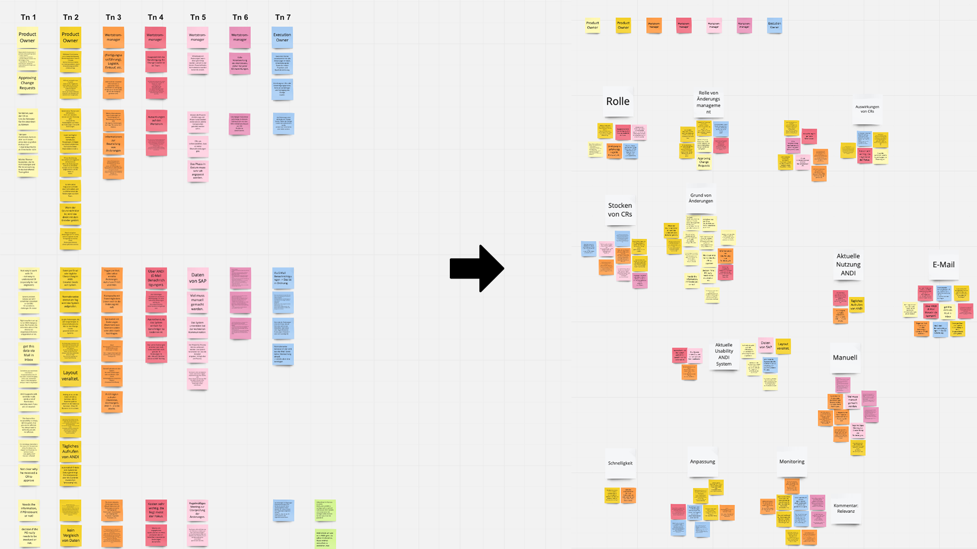
I conducted 7 semi-structured interviews via Zoom with users from different roles, such as Product Owners and Value Stream Managers from different countries. The interview included questions related to their role, workflows and experiences with CRs and frustrations with the internal tool. With the insights of the interviews I created an affinity diagram to define key findings and user requirements for the dashboard design.
- After each interview I wrote the insights on sticky notes with a color for each participant.
- I grouped all sticky notes based on similarity and created white sticky notes with a “label” for each cluster
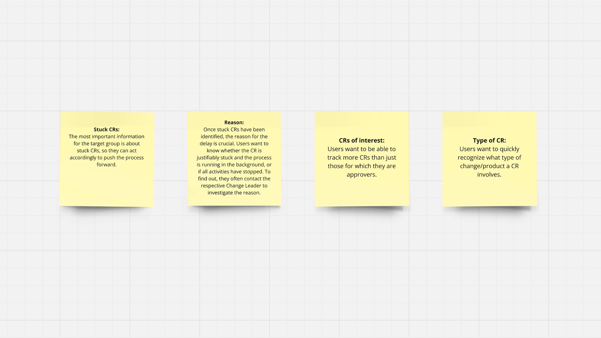
- Based on the white sticky notes I defined the overarching key findings and the role-based key findings.
Role-Based User Needs
Based on previous research, I identified specific user-needs based on their role.
Product Owner
- What is the status of the project I am particularly interested in?
- Which CRs are being created that affect my products?
Value Stream Manager
- When is the next phase-in date for the implementation phase?
- Which changes are affecting my plant?
PHASE 3: COMPETITOR AND MARKET RESEARCH
Competitor Analysis
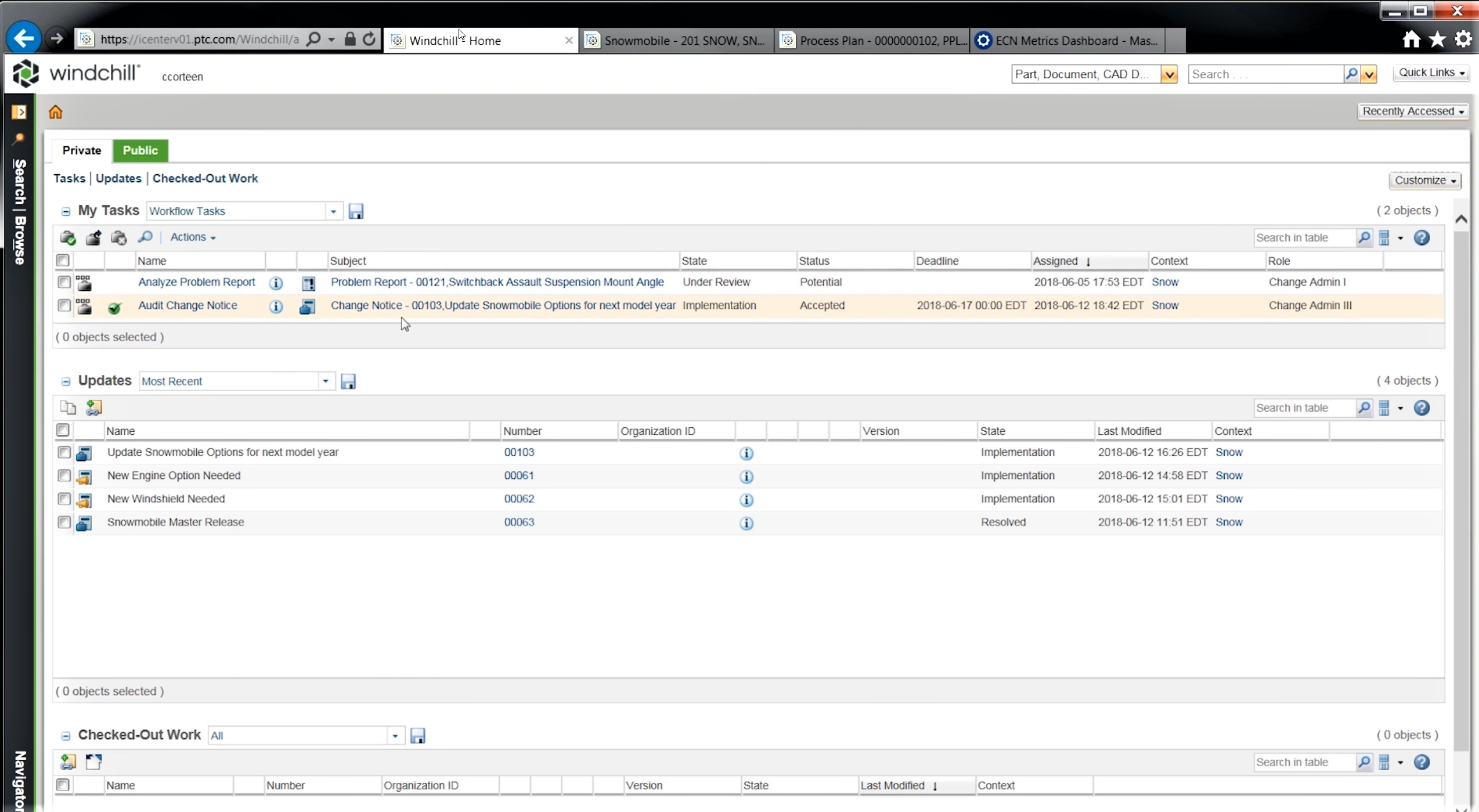
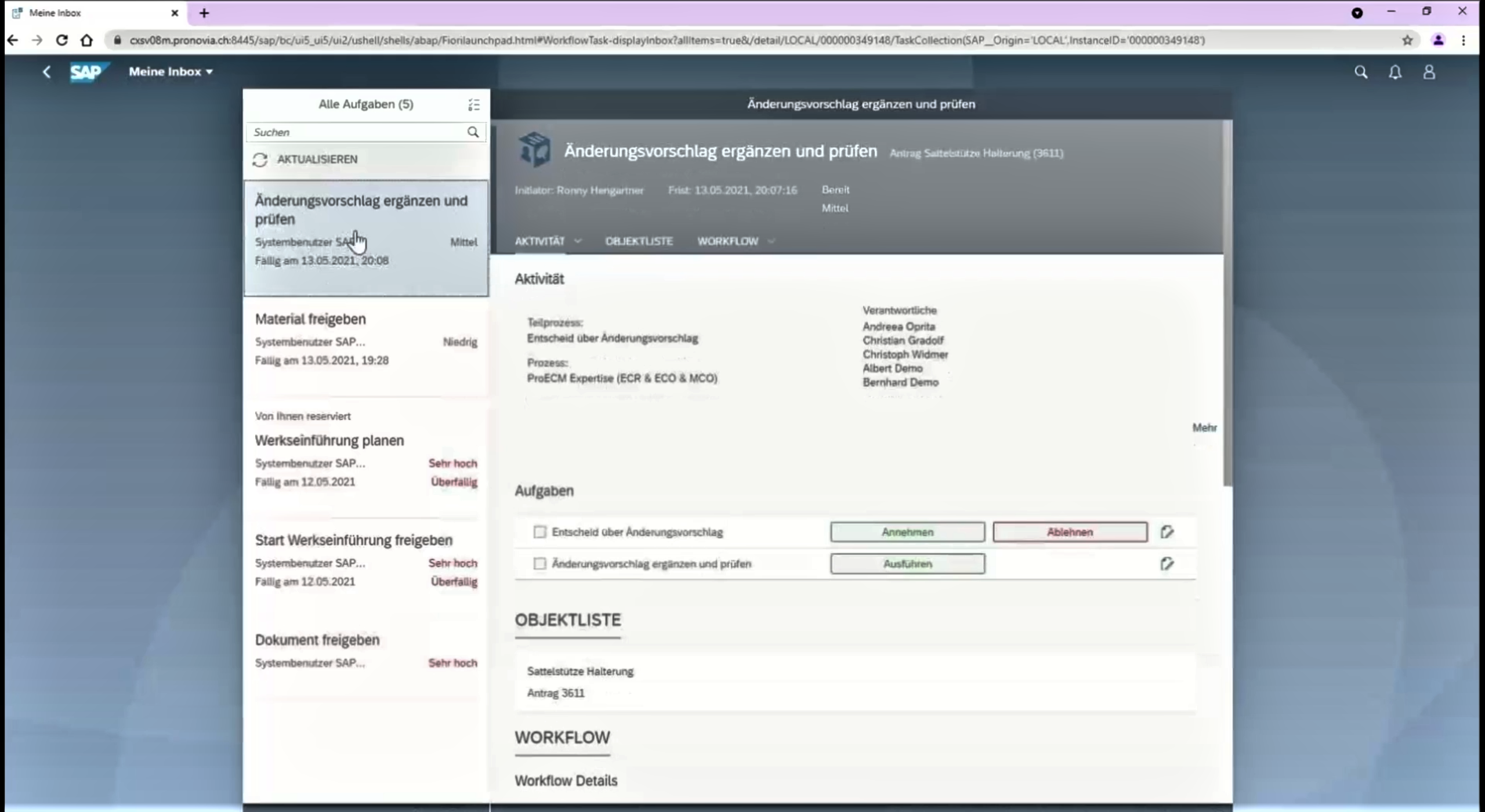
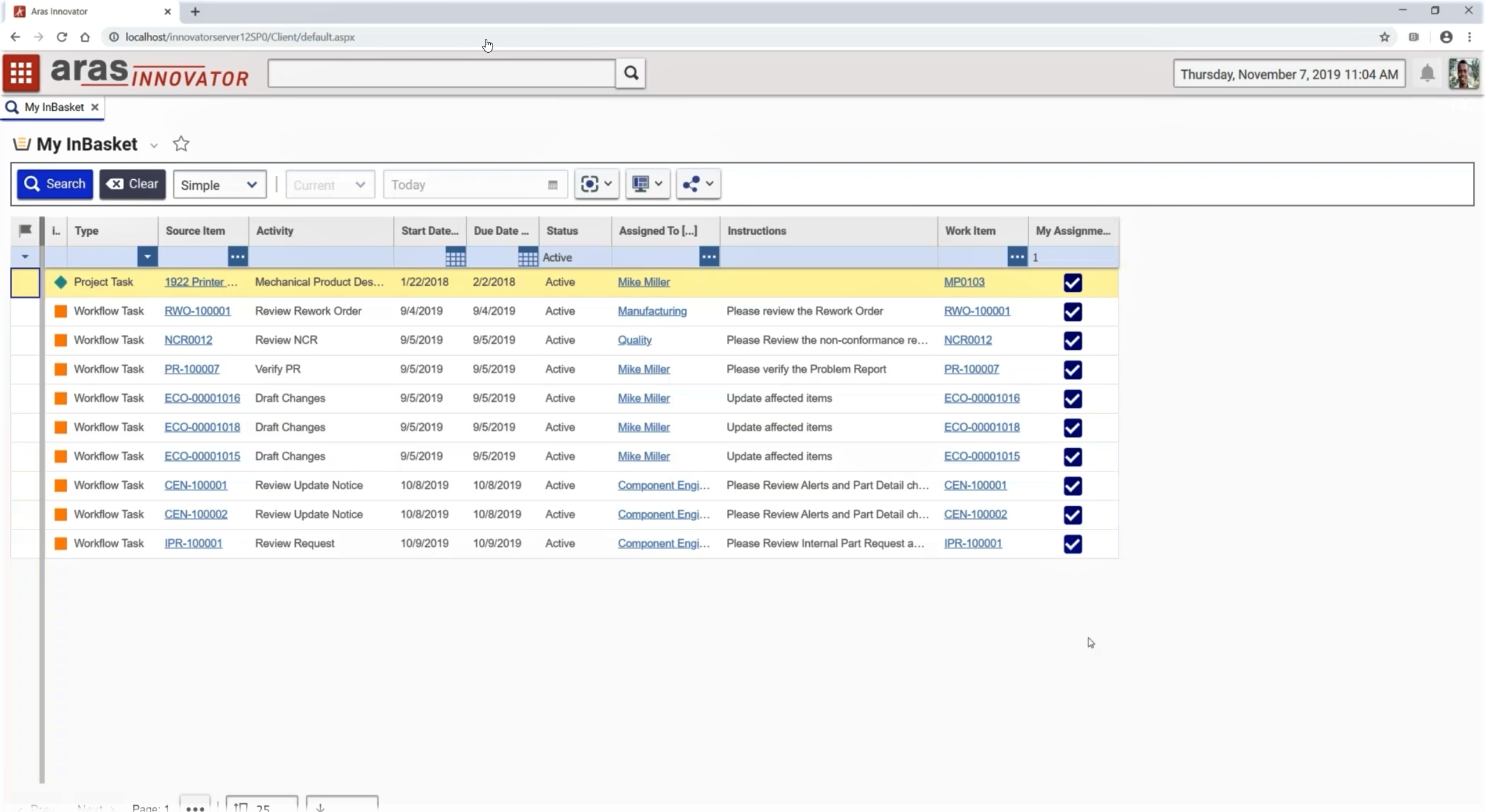
To understand how other systems handle change management, I conducted a competitor analysis of major Product Lifecycle Management (PLM) tools, such as Windchill, Aras, and SAP PLM. My goal was to identify features that could improve the user experience within ANDI, particularly around CR monitoring.
Focus areas for the competitor analysis included:
- How is CR status displayed to the user?
- What visual elements help prioritize critical tasks?
- How are CRs organized to improve accessibility?
Outcome:
- Discovered that visual elements like color coding, deadline indicators, and task prioritization are key to making CR tracking more intuitive.
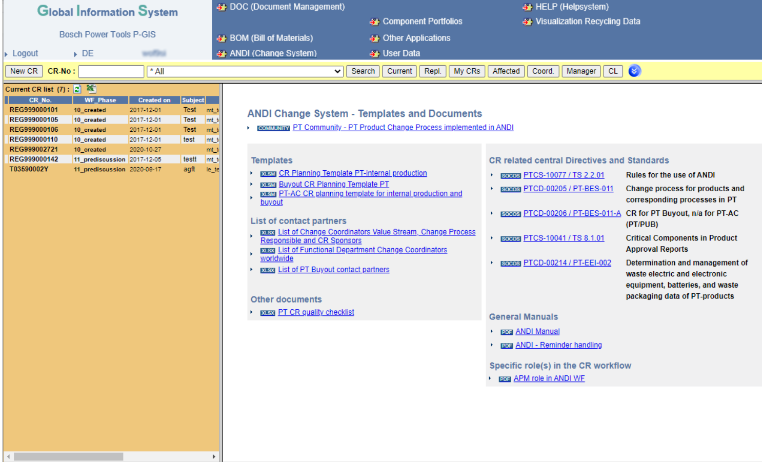
- Identified that ANDI’s existing interface lacked these visual cues, making it harder for users to assess CR status quickly.
PHASE 4: DEFINE
Defining User Stories
Based on the insights gathered from interviews and research, I crafted User Stories to guide the development of the new dashboard concept. These stories were aimed at addressing the specific needs of different roles and improving the overall user experience of monitoring CRs.
Two primary user stories were developed to guide the design:
- User Story 1: “As a new ANDI user, I want to easily set up my dashboard so I can quickly access the CRs relevant to my role.”
- User Story 2: “As a Product Owner/Value Stream Manager, I want to use the dashboard to check the status of the CRs that particularly interest me.”
Outcome:
- These User Stories provided a clear direction for the next phase of design, focusing on making CR tracking more personalized, efficient, and role-specific.
PHASE 5: DEVELOP
Develop the conceptual design
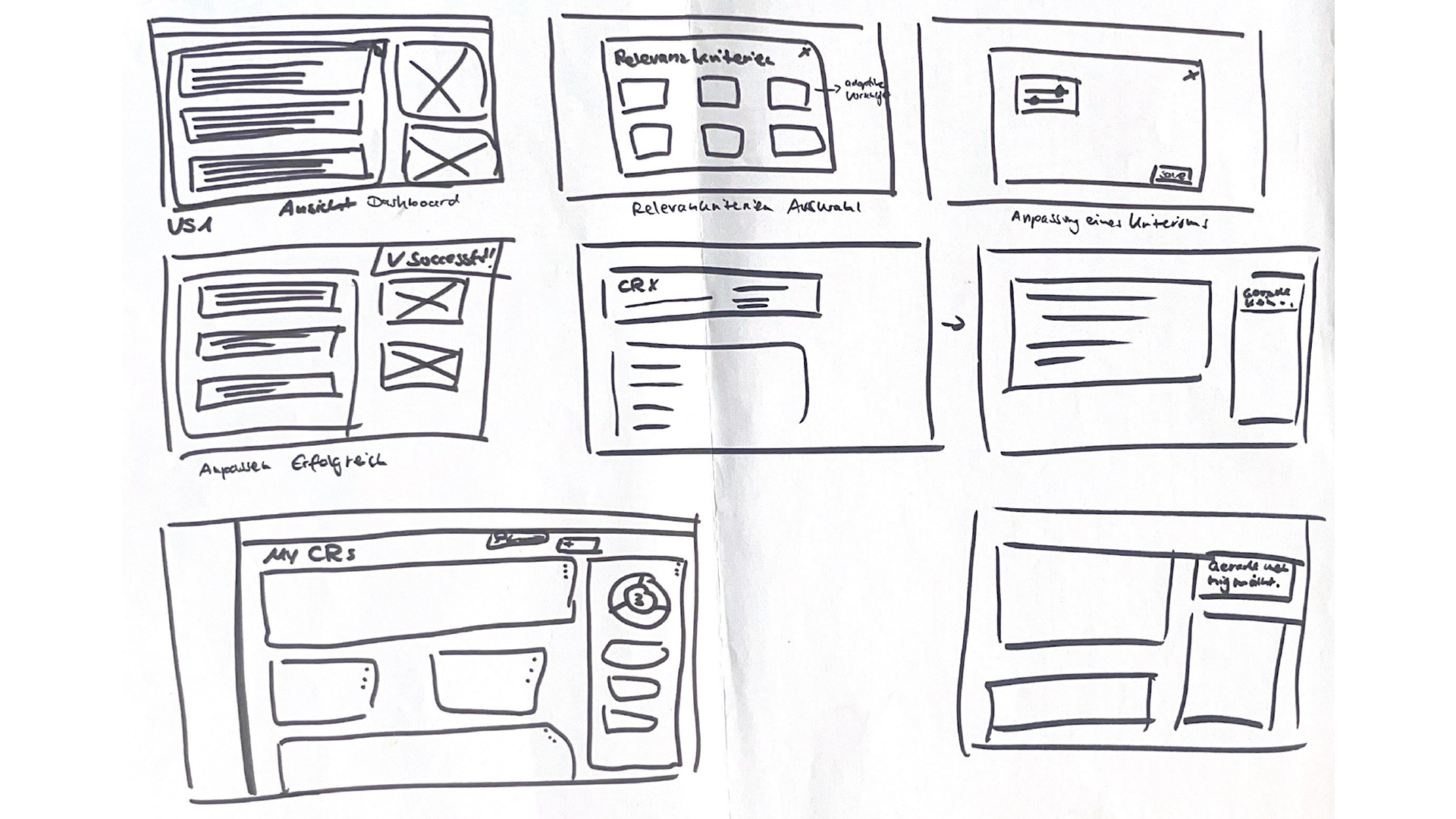
I began designing the dashboard with a focus on role-specific information. This involved creating wireframes and mockups that catered to the unique needs of different user roles. The goal was to ensure that the system would present the most relevant CR data without overwhelming users with unnecessary information.
Adaptation Concept
During this phase, I identified that manual customization alone could create challenges for users who were uncertain about how to tailor the dashboard to their needs. To mitigate this, I explored role-based adaptive customization, which would recommend configurations based on the user’s role and experience level.
The role-based customization approach offers several advantages, particularly in addressing user uncertainty. The idea was to guide users by presenting pre-configured dashboard templates based on their roles, reducing the need for manual customization. This concept was influenced by examples like iGoogle, which allows users to create personalized homepages with widgets relevant to their interests.
Key features:
- Role-Specific Views: Each user would be presented with a dashboard tailored to their role (e.g., Product Owners would see CRs affecting their products, while Value Stream Managers would focus on plant-related changes).
- Automated CR Tracking and Alerts: The system would automatically track CRs and notify users when the status of a CR changed or if a CR had been inactive for an extended period.
- Visual Cues: Inspired by competitor analysis, I incorporated visual elements such as color coding and icons to help users quickly assess the urgency and status of CRs.
User Interaction and Flow
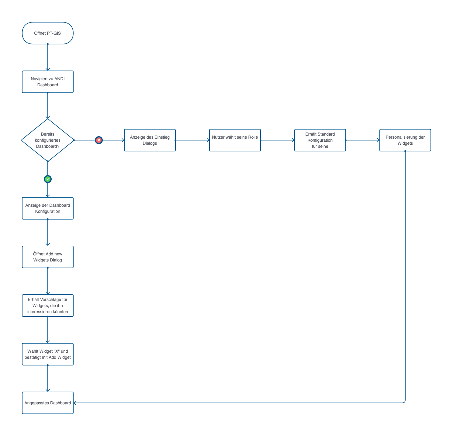
The user interaction process was mapped out through a User Flow Chart, detailing the steps a user takes to customize their dashboard. Depending on whether they follow User Story 1 or User Story 2, the user is guided through the selection and configuration of widgets to reach a fully personalized dashboard. This chart served as a visual tool to ensure the interface met user goals efficiently.
Role-Based Customization
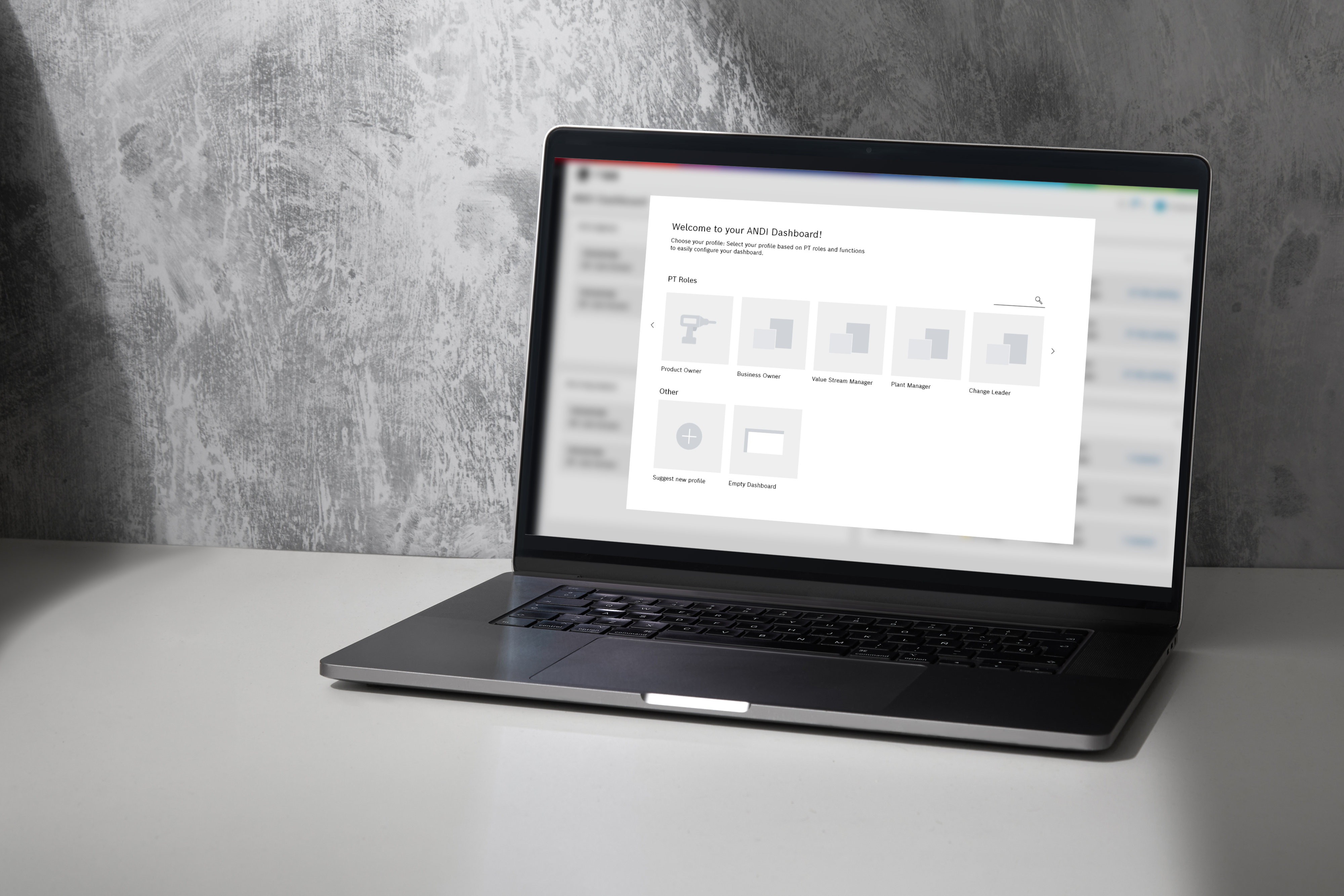
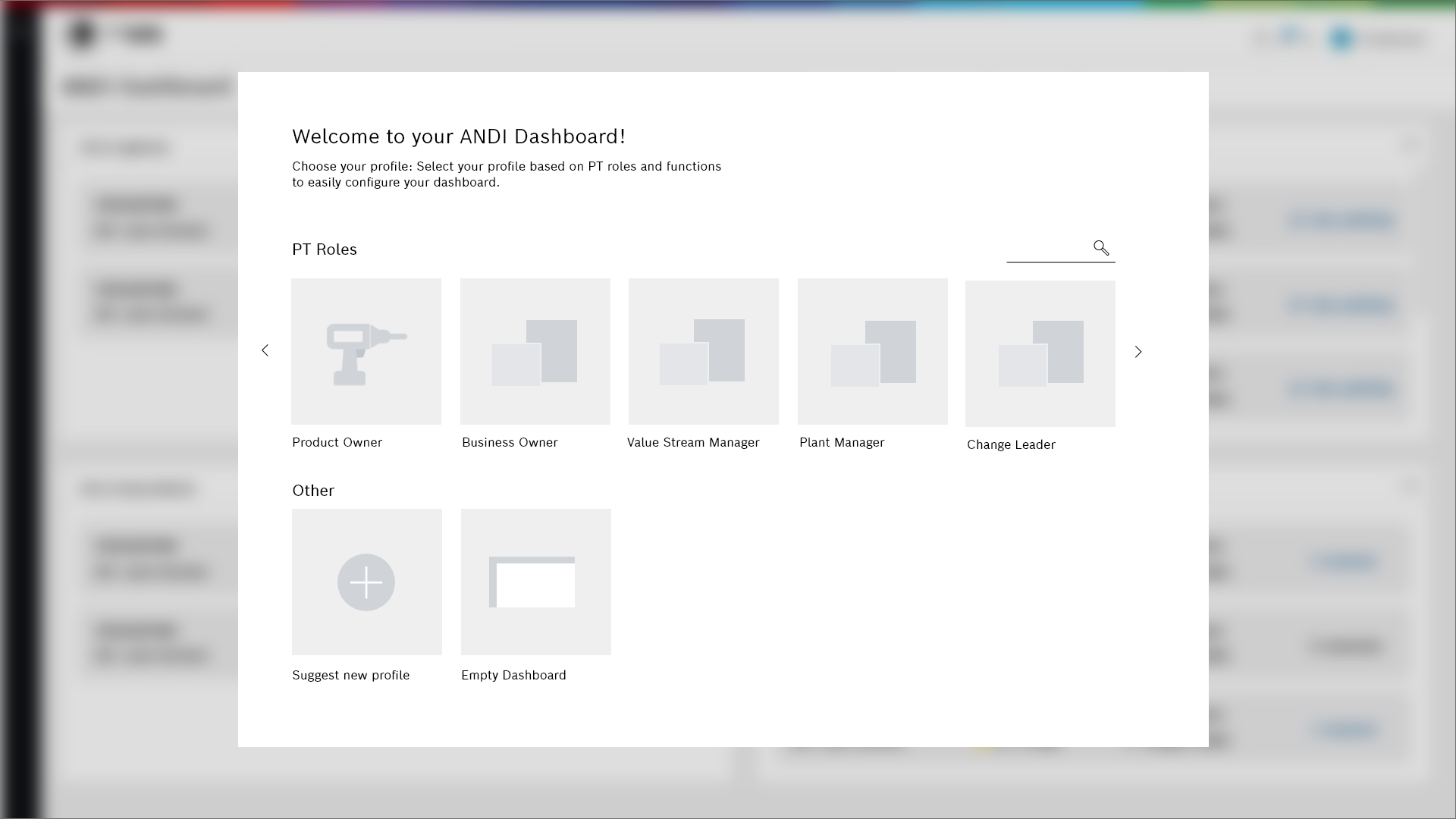
In the ANDI Dashboard, role-based customization ensures that when a new user logs into the system for the first time, they are greeted with a dialog that offers them a pre-configured dashboard based on their role (e.g., Product Owner or Value Stream Manager). Users can accept the suggested configuration, propose a new role, or even start with a blank dashboard. This adaptive approach reduces the learning curve for new users while ensuring that they have access to the most relevant information from the start.
The system is also designed to learn from the configurations of other users within the same role. If other users manually adjust their dashboards, ANDI will incorporate these adjustments into future role-based templates, creating a more dynamic and responsive system.
Personalized Widget Content
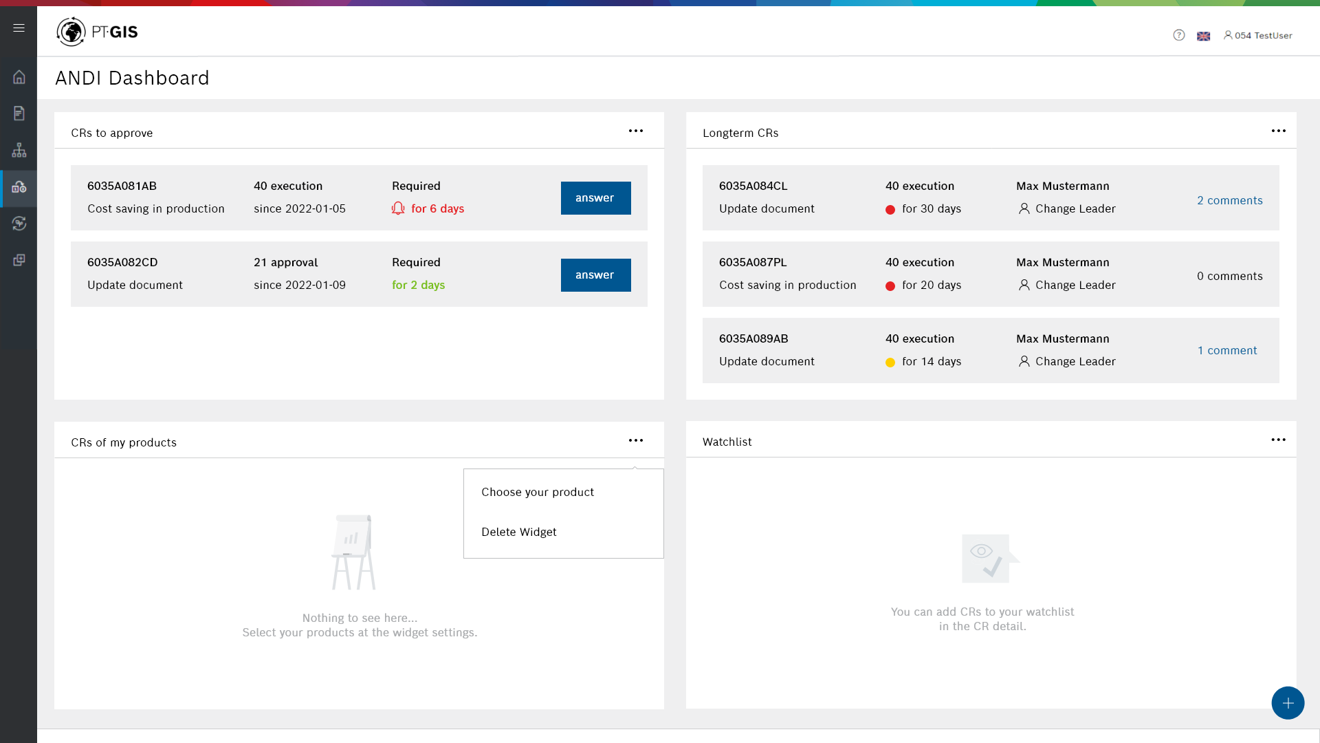
To further enhance the user experience, I introduced manual widget personalization within the dashboard. This allows users to fine-tune the information they see by customizing individual widget contents. After selecting their role and receiving a pre-configured dashboard, users can personalize their widgets by manually entering specific data relevant to their work. For example, a Product Owner might customize their widget to display CRs related to a particular product, while a Value Stream Manager might focus on a specific production plant.
This manual personalization maintains user control and ensures that each user’s dashboard remains highly relevant to their responsibilities without infringing on their privacy.
Adaptive Dashboard Configuration
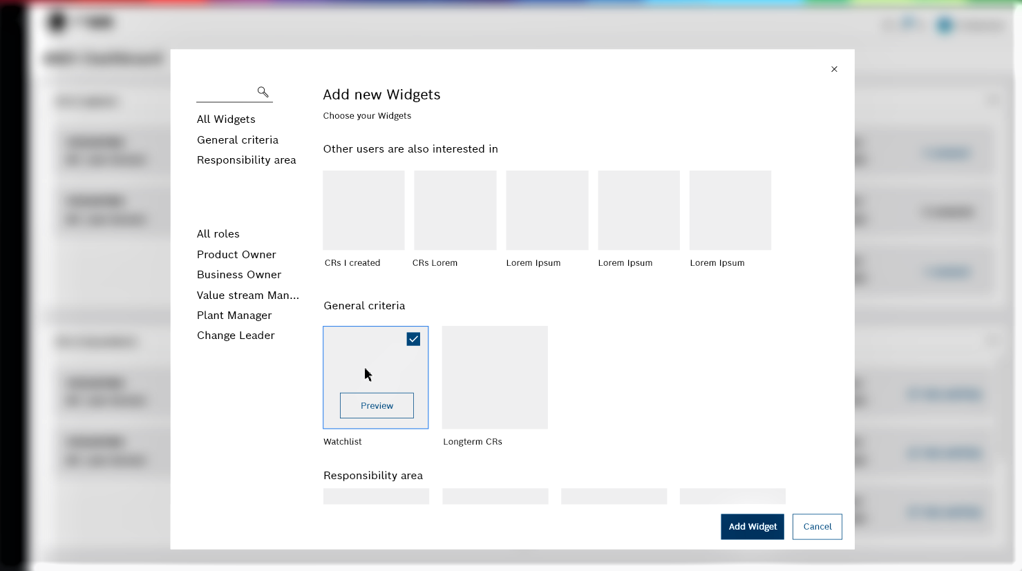
The adaptive dashboard configuration process simplifies the addition and removal of widgets based on user preferences. After an initial configuration, users can continuously adjust their dashboard by selecting the “Add Widgets” option. The system assists users by recommending widgets based on the selections of other users in similar roles. For instance, if a significant number of Product Owners add a specific widget to track product changes, the system will suggest that widget to new users in the same role.
This adaptive feature ensures that the dashboard remains flexible and scalable. As more users interact with the system, the recommendations become more refined, making it easier for users to discover widgets that might otherwise go unnoticed. The system continuously updates its suggestions based on the evolving preferences of the user community, creating a personalized yet collective dashboard experience.
Interface Design
The design of the ANDI Dashboard focused on creating a clean and user-friendly interface that adhered to Bosch’s style guidelines (e.g., colors, fonts, grid system, and icons). The goal was to provide a positive user experience by ensuring the interface was intuitive and adaptive to user needs.
Dashboard Layout and Flexibility
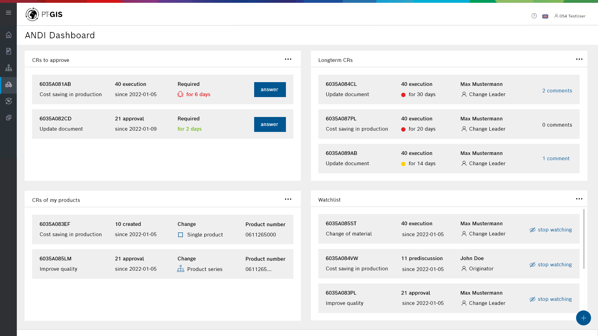
The dashboard layout allows for flexible positioning of widgets. Movable panels enable users to drag and drop widgets to their preferred locations, prioritizing critical information based on their work needs. By default, key information, such as CRs requiring approval, is placed in the top-left section of the dashboard, where it receives the most attention. Other widgets, like the Watchlist, which displays less frequently updated information, are placed in less prominent areas.
Design Principles
The design was guided by core principles of dashboard simplicity and functionality:
- Minimalist Design: Non-essential visual elements were reduced to ensure focus on key data. Background elements were kept subtle (e.g., light gray and white), and table headers were removed to declutter the interface.
- Data-Driven Layout: CR information was divided into static elements (e.g., CR number and description) and dynamic elements (e.g., phase updates), with critical details placed prominently for easy access.
Accentuations and Visual Cues
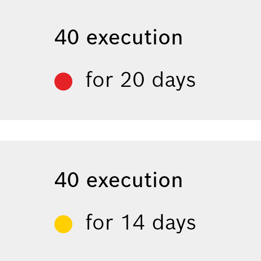
To enhance situational awareness, I added accentuations in the form of color intensity, form, and added markers.
- Color Intensity: Differentiates CRs that have been delayed for a long time, using yellow and red dots to indicate urgency.
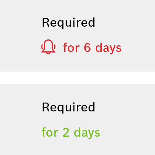
- Added Markings: A distinction is made using the colors red and green. Red indicates that an action should be taken. This reminder is supported by an added marking in the form of an icon.
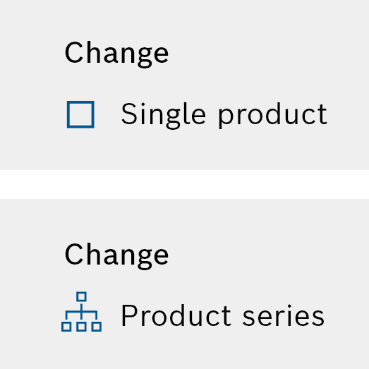
- Form and Icons: Different types of changes, such as single product versus product series, are represented by distinct icons for quick recognition.
PHASE 6: EVALUATION
Conduct usability testing for iteration
After the prototyping, I conducted a user evaluation in form of Usability testing. I used the Wizard of Oz Method and “Think Aloud” by asking users to try out the prototype on Figma and perform various user tasks. The received feedback was:
- Role-based customization was considered as helpful for onboarding and dashboard configuration, especially through the distinction of use cases. User suggestions (e.g., “Suggest new profile”) add value due to the community aspect.
- Community-driven dashboard sharing is expanding the dashboard with the ability to share configurations with other users is recommended. A workflow should be developed to determine when a suggestion becomes a defined role.
- Manual personalization could be made easier by offering factory-specific widgets under “Add new Widgets.”
- The dashboard effectively integrates key information for monitoring CRs, and situation awareness is enhanced through accentuation. The ability to adjust alert levels would further improve this feature, potentially paired with advanced email notifications.
- The “Add new Widgets” dialog is rated highly for ease of use, especially in CR recommendations based on roles. The dashboard layout could be made even more flexible with options to adjust widget sizes for better clarity.
- The adaptive dashboard contributes to a positive user experience. And stakeholders believe it improves change management by covering most use cases.
Learnings
After the evaluation, I handed in the thesis and I was brought onboard of the team to lead the execution of a first MVP. Therefore, I planned and conducted more usability testings with the cut down MVP version of the concept. However, I can not publish the iterated versions due to confidentiality.
- Concept vs. Execution:
Getting onboard as a Product Owner after completing my thesis helped me recognize the differences between the concept phase and real-world execution. While my thesis involved academic research on an adaptive dashboard, where I developed an innovative concept, I had to cut the ‘smart/dynamic’ features for the MVP in order to deliver minimum value to users as quickly as possible. - Challenge of Learning Change Management in a Short Time:
Since I had no prior experience in engineering change management, one of the biggest challenges was to understand this process in a very short amount of time. I spent time researching the domain, talking to stakeholders, and diving into the real-life workflows of users. This learning process trained me in understanding complex software and processes in a limited timeframe. - Managing the Project within 3 Months:
One of the key challenges was the limited time available to develop the concept in 3 months. In this timeframe I had to balance in-depth user research, prototyping, and iterations, and the academic writing of the report. Working in a tight timeframe taught me how to prioritise essential features, efficiently conduct usability tests, and to plan a good project time plan.

